
Barbora Hinnerova
LOCATION DATA
5 MINS READ
Points of Interest: How to Get the Most Out of POI Data for Location Analysis
Points of Interest data proved to have its place in location analytics for many industries. But is there a way to make POI data even more accurate and beneficial for your business? Read on to find out.

What is Point of Interest (POI) data?
POI data represents physical locations of interesting or useful places that attract people’s attention, such as tourist attractions, big supermarkets, pharmacies, office buildings, or even that tiny hot dog stand on a train station.
For us, regular people, the most common use case for POI data is when we use GPS or online maps to get to a specific location because we don’t always know the particular address or coordinates.
Instead, we just want to get to the nearest McDonalds or gas station. Why should you, as a business, care about the Points of Interest? Because it can help you with decision-making, connecting with customers and expansion strategies as it reveals the vital location context of specific areas through geospatial analysis.
Example of Point of Interest Data Use Case
A good example is site selection for a new branch of your business in the centre of a city. Location data can significantly enhance retail experiences and marketing strategies by providing insights into customer behavior and preferences.
Imagine you sell clothes and toys for babies named “Babycot.” Ideally, you use POI to map influential factors on a potential site, such as competition in the area, traffic infrastructure, and other places relevant to your business, to ensure you choose the best location possible. However, doing location analysis only with raw POI data won’t give you the perspective you need.
After all, each point of interest has a different significance and attracts different kinds of people and different amounts of people. So, how do we deal with that and make the POI data most accurate?
Grouping POIs into Categories
Suppose you want to get the best out of the POI data. In that case, it’s ideal to divide them into categories - collections of similar points of interest that contain more details within a category type.
Grouping POIs into categories can also help identify and optimize services such as telecommunications, retail, and public infrastructure. For our Babycot, there can be many relevant groups—for example - shops with clothes. While parents buy clothes for themselves, they may also want to buy something for their baby.
Also, kindergarten! Parents pick up their children from kindergarten; there is a shop with baby clothes and toys right next to it. So they could stop by. Then, the categories you would use here may be “Shopping - Clothes” and “Education - Kindergarten.”
If you get a whole set of POIs for the entire country, you need to consider that not all are relevant to your case. Thanks to the division into categories, you can easily select only those that make sense and avoid unnecessary expenses and database load. Especially these days, when computation time is becoming the currency of the future.
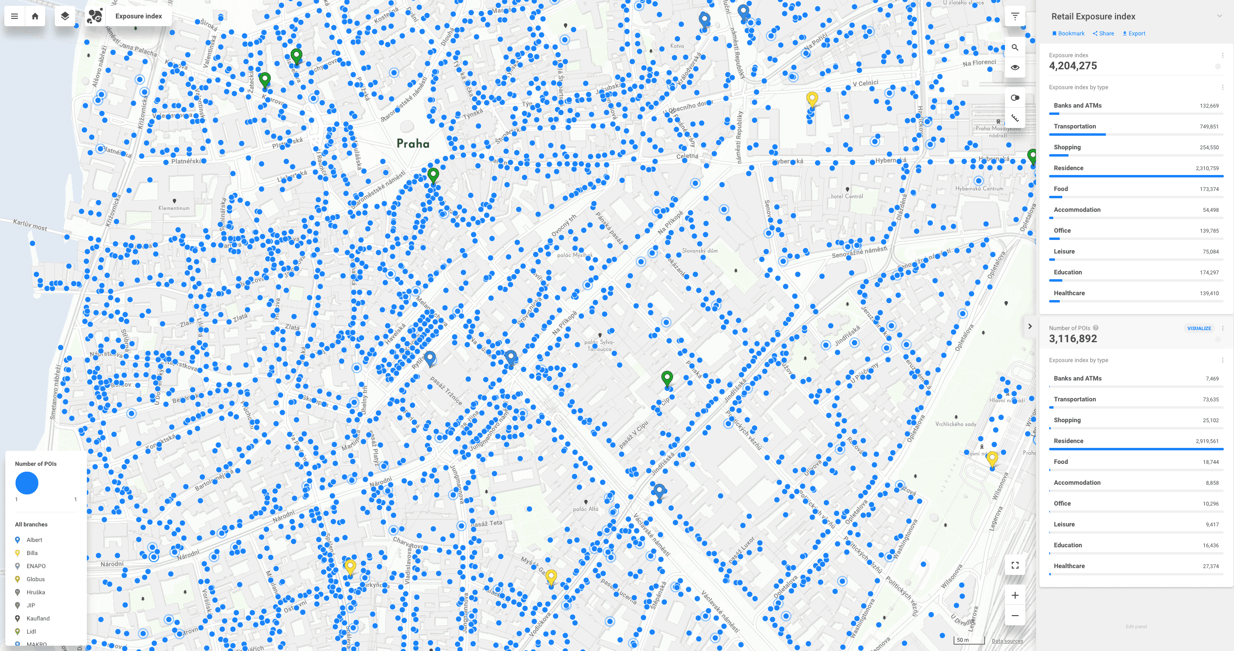
Weighting the POI for the Most Accurate Analysis
How does the weighting of POI work? Each point of interest gets a value according to its significance to the surroundings. So for example, a small grocery store on the street corner doesn't have the same value as a huge shopping mall with many shops, and a tiny hot dog stand on the train station does not attract crowds as McDonald's on the main square does, therefore gets a lower value.
The picture below shows all the Points of Interest in the center of Prague visualized on a dot map representing where the POIs are located with no consideration of their size and influence.
Visualization of raw POI data.
In the picture below, we see the visualization of weighted POIs. The color represents the category and the size of the dot corresponds to the assigned value of each point. This gives us more precise information about the location.

Visualization of POI categories with assigned values.
At CleverMaps, we have developed our own algorithm for weighting the POIs and we are offering it as a solution called the Retail Exposure Index. We can read the Retail Exposure Index as reversed mobility data.
Mobility data reveal the actual movement of people on a map, but the Retail Exposure Index tells us WHAT attracts people to go to specific locations. By weighing the points and grouping them into an index, we can get an estimation of the location's traffic for a far more reasonable price than with mobility data.
Where to Get the POI Data?
One of the most common POI data sources is open-source databases that upload a huge amount of data every day. Developers can create applications that leverage real-time data from these databases to offer users real-time navigation and tailored experiences.
It is crucial to keep POI data up-to-date to ensure accuracy and reliability. For example, OpenStreet Maps or Gisgraphy. Each POI must be clearly defined with specific characteristics such as geographical coordinates, name, and address.
Providers often offer raw POI data, however, some providers can offer a complex solution directly. Tourist maps are particularly useful for exploring cities and enhancing the sightseeing experience for visitors.
For example, The DataAppeal Company offers a wide range of solutions compiled from POI data including Sentiment and Market Intelligence. Users rely on POI data to find nearby amenities, navigate traffic, and receive personalized advertising based on their location.
At CleverMaps, we crafted the Retail Exposure Index, which is ideal for site selection, expansion strategies, branch network optimization, and more.
Read next: Why is Point of Interest Data Gold in Retail.